Huntr Blog
Resume Design Principles and Tips to Get You Hired
January 08, 2025
To make your resume stand out, you need to have a good resume design. A hiring manager's first impression of you will be your resume. If the margins are too compact or there's too many graphics, you might visually turn-off a hiring manager who would've considered you for your accomplishments alone. While having a nicely-designed resume is key, you don't want to have an infographic resume or any other resume design that takes away the focus from the core content of your accomplishments. In this post, we'll share some of the resume design principles and tips that'll land you in the interview pile alongside some resume design templates you can find online.
Build your resume using a design-friendly template
Sign up for Huntr to start building your resume using one of the professionally designed templates.
Resume Design Principles and Tips to Get You Hired
1. Choose a readable font
There are countless readable fonts online that you can use for your resume, such as Roboto, Merriweather, Playfair, Arial, and more. Sans serif fonts tend to be more modern, while serif fonts tend to be easier to read. From a design perspective, you can use either or depending on what the overall design of your resume is looking like. The font size should be considered. While you might want to fit everything to one page, you want to ensure hiring managers can read your resume with ease. Passing your resume around to friends and family for feedback and using a resume checker to get feedback on your resume can help you modify your resume for any potential issues. You want your resume to be read, not just looked at. So, make sure you've got readable fonts and the easy-to-read font sizes.
2. Add a pop of color
Your resume template doesn't need to be this ultra creative resume. You can add a pop of color to make your resume really pop. The best colors to use on your resume depend on your industry. If you're applying for a healthcare job, you might use blue. If you work in the food industry, red is often associated with that niche. If you work in the fashion industry, black is the best color to use. If you work in communications, blue is contrast color you can use. If you're applying to a salon, you might use pink or purple to contrast. If you're only applying to one specific company, you might choose to use that company's corporate colors on your resume to add a subtle pop of color.
3. Use a design that matches industry standards
Many people have seen resume templates with photos on them. However, in the United States, it's inappropriate and unprofessional to have resume photos. Whatever resume design you end up working with, you want to make sure that it presents you in the best light and is free of bias. Your resume design doesn't need to be flashy. There's a reason why white-and-black resumes often perform well, it's because they focus on the resume accomplishments that help you land an interview. That doesn't mean you have to have a basic resume, but it means there are still general guidelines regarding graphic design elements that play a role in whether or not you get an interview.
4. Have natural white space
Many people will shrink margins in an effort to make their resume fit to one page. However, on average, you want margins to be about one inch wide. Having white space on your resume isn't a bad thing. It's clean from a design perspective. And it makes things easier to read. People are used to reading content with margins to help them read more easily. When there's wall-to-wall text on a resume, it can feel overwhelming to the reader. The margins allow them to read comfortably and with ease. So, avoid changing margin sizes to make something fit to a page or to add more content to your resume. It's not about quantity, it's about quality.
5. Make content easy to scan
From a design perspective you want your resume to be easy to skim. Hiring managers tend to scan resumes for six to seven seconds. Bullet points visually help hiring managers scan content. Some people might even bold words on their resume to highlight key resume accomplishments to add more emphasis to those points. A potential employer will find your resume easy to scan if you have a bold header using standard keywords like "Work Experience" and "Education." The font you choose, the margin size (that one-inch), and placing keywords in the right spots make your resume easy to scan too. Always put your best accomplishments first. As that's what'll stand out to hiring managers.
6. Include relevant links
When it comes to the contact information section, most of the time, people will add links here. From a visual perspective, making the resume interactive by having clickable sections like links can make the resume more engaging. Adding a LinkedIn profile link or a portfolio link can add a nice contrast. Links often have an icon next to them or are underlined or pop in a different color. Either way, there's usually visual elements that surround links to make them stand out more. This resume design tip involves adding emphasis to your links too, especially if you do want people to click on them and further engage with your application. If you've got important information on the link, you'll want to add more emphasis to it.
7. Use columns when appropriate
Columns are sometimes added to a resume to make them more visually appealing. The downside to columns is that it leaves less room for you to write your work experience if you've got a lot of big accomplishments from being more senior in experience level. If you're a new grad or a career changer, columns are a great way to make your resume look visually appealing without showcasing how inexperienced you are. Part of your resume design is to make the resume stand out more but also it can mask things you don't want people to notice or highlight things you do want people to notice. And columns are pretty good at giving you more margins to make your document easier to skim and making you focus only on your greatest accomplishments on your resume rather than adding too much detail.
8. Avoid infographics
So many people recommend adding infographic resumes, but usually this is too gimmicky for your resume. Having visual elements like an icon or a column is pretty standard. However, infographics on a resume aren't quite that practical. Not only do they take up too much space, they also usually give very little information. The goal of your resume isn't to be flashy. It's to highlight your biggest accomplishments to convince someone to hire you. Having an infographic just takes up valuable space that would be better off being served in written content format to sell you as a candidate. The bulkiness of an infographic resume and the little information it shares isn't valuable enough to include. It might look appealing, but you're better off keeping the infographics for presentations.
9. Use the right file name
The resume file name is an often overlooked component to resume design. The problem with it is that it usually is called things like "Final" or "V2" or some variant that showcases that you've made multiple versions of this document. But hiring managers don't want to know that. They want to know that you want to work at their company, not any company out there. So, when naming your resume, name it something simple like your name and the job title of the role you're applying for. That way, it looks like you used a resume tailor to tailor your resume for this specific job. Avoid naming your resume file something that gives away that you're looking around or you had to make multiple versions of your resume to get it where it is now.
10. Use simple icons
You don't need to include icons on your resume. However, sometimes icons can work well in your resume design. For example, people often use icons to highlight their contact information. They might use it as bullet points for their email address, portfolio site, LinkedIn link as an example. Icons can also be used in place of bullet points for your resume, but it's best to keep those simple. Overall, icons aren't necessary on your resume. It depends on the style of your resume design, which will determine how they can best highlight important information.
11. Add emphasis to your contact information
There are two important sections of your resume. The work experience section and the contact section. While the work experience is what they'll scan the most. It's the contact section that'll hold the most important information to get in touch with you and to learn more about you. The contact section often needs to stand out from the rest. A well-designed contact section will have emphasis on your name and might include crucial information about how to reach you and where they can check out your portfolio or LinkedIn to learn even more about you.
12. Use a resume template
A job seeker is likely better off using an existing resume template to ensure solid design choices instead of trying to make one from scratch. A resume template will ensure that your content fits in the design to help you achieve a well-designed resume. You can find various resume templates on Huntr that allow you to choose different pre-set colors that are design friendly. A resume template can allow you to create a properly designed resume at a fraction of the cost. For example, it costs $40/month to use Huntr's resume builder. And unless you're tailoring your resume for multiple jobs, you can sign up for one month. Compared to hiring a professional resume design company, you could be saving hundreds of dollars on your resume design. Some resume design services cost $600 for your resume alone.
13. Make your resume print-friendly
While having a visually pleasing resume can help you stand out. A resume without too many different colors might be more print-friendly. Having a white background could be more cost-effective for a business who's printing out your resume to read them. Also, you want to ensure that there's a high-level of contrast between the text and the background. That's why white-and-black resume designs tend to be most popular. They're the most print-friendly design out there. Using fewer colors for your resume would be better than using a lot of color, at least from a print perspective. A resume that stands out still needs to be easy to read and easy to print.
14. Don't over-design your resume
The most important design tip to follow is keep it simple. A plain-text resume design can be just as effective as a nicely designed one. You want the design to show a little bit of your personality. However, you don't need to over-design your resume. And by that I mean, a resume where everything is a design element like an infographic or a graph or chart. Resumes are meant to be read. You need to add emphasis to your biggest accomplishments, not the resume design. A simple resume design or using a resume template can allow you to create an effective resume that looks visually pleasing.
Resume Design Templates
1. Classic
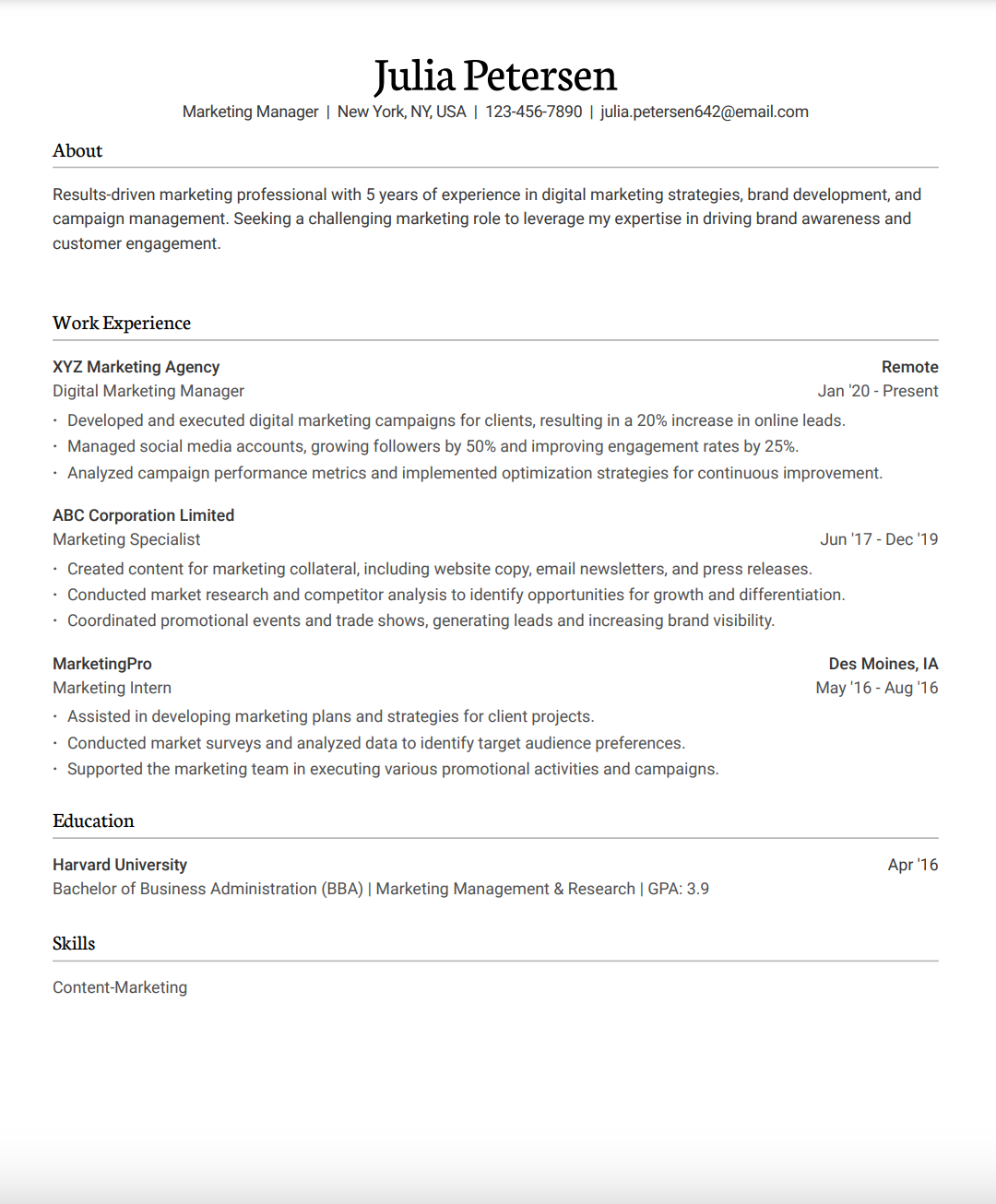
2. Cedar
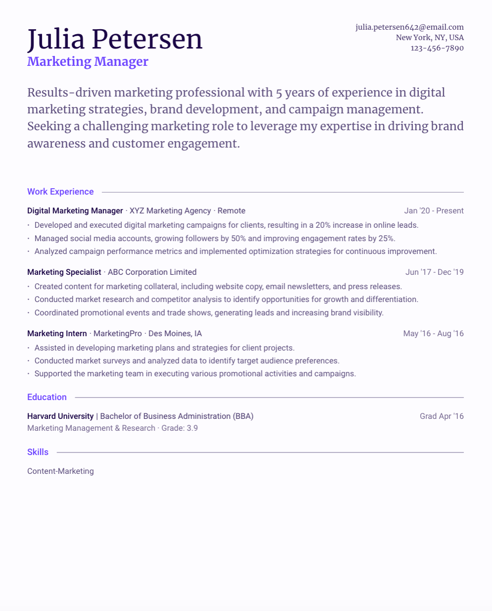
3. Hemlock
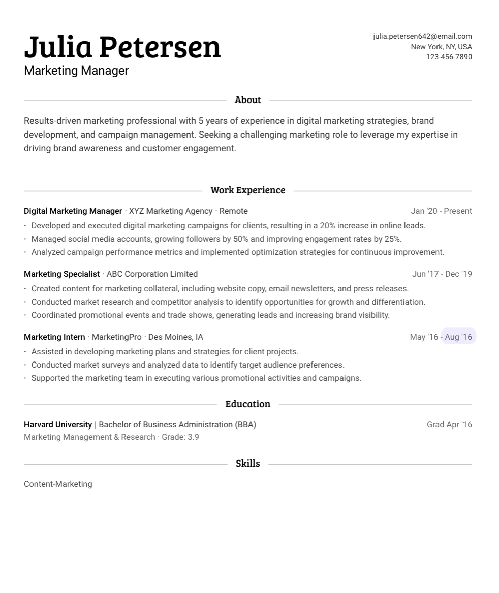
4. Maple
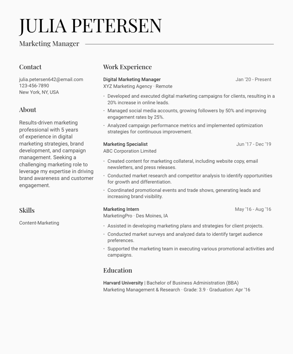
5. Aspen
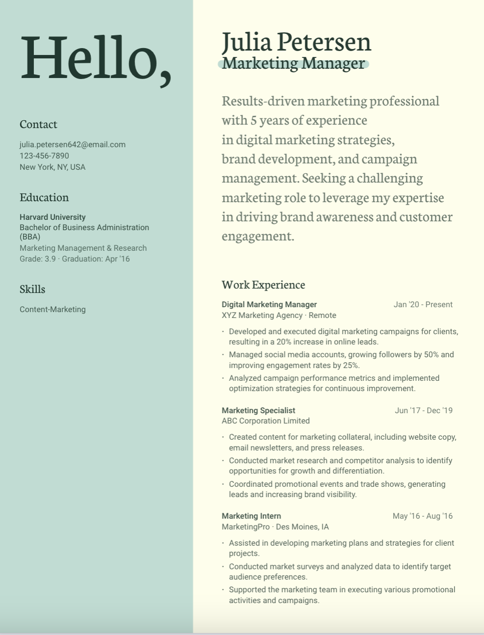
6. Spruce
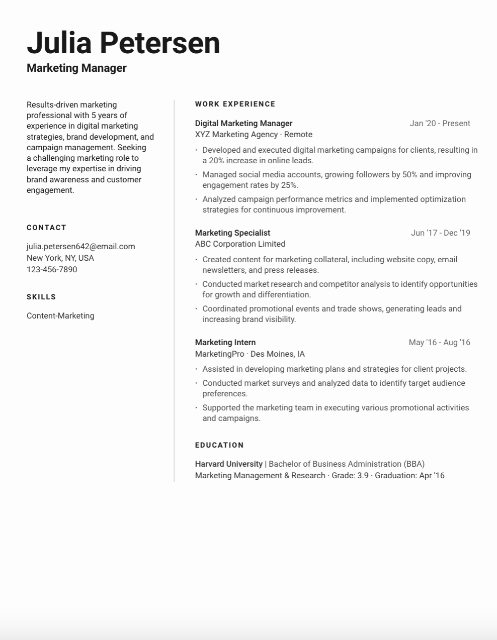
7. Bonsai
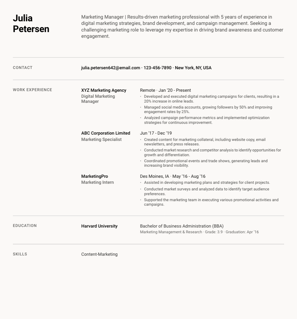
Conclusion
When it comes to resume design, you can find resume templates that are visually appealing that allow you to create a stunning resume without needing design skills. To use one of the resume templates or to start working on your resume, you can sign up for Huntr today.
Get More Interviews, Faster
Huntr streamlines your job search. Instantly craft tailored resumes and cover letters, fill out application forms with a single click, effortlessly keep your job hunt organized, and much more...
AI Resume Builder
Beautiful, perfectly job-tailored resumes designed to make you stand out, built 10x faster with the power of AI.
Next-Generation Job Tailored Resumes
Huntr provides the most advanced job <> resume matching system in the world. Helping you match not only keywords, but responsibilities and qualifications from a job, into your resume.
Job Keyword Extractor + Resume AI Integration
Huntr extracts keywords from job descriptions and helps you integrate them into your resume using the power of AI.
Application Autofill
Save hours of mindless form filling. Use our chrome extension to fill application forms with a single click.
Job Tracker
Move beyond basic, bare-bones job trackers. Elevate your search with Huntr's all-in-one, feature-rich management platform.
AI Cover Letters
Perfectly tailored cover letters, in seconds! Our cover letter generator blends your unique background with the job's specific requirements, resulting in unique, standout cover letters.
Resume Checker
Huntr checks your resume for spelling, length, impactful use of metrics, repetition and more, ensuring your resume gets noticed by employers.
Gorgeous Resume Templates
Stand out with one of 7 designer-grade templates. Whether you're a creative spirit or a corporate professional, our range of templates caters to every career aspiration.
Personal Job Search CRM
The ultimate companion for managing your professional job-search contacts and organizing your job search outreach.

